
Looking Towards The Futura
A short publication which explores the journey of the typeface 'Futura' in becoming the font of a new, idealised future. The narrative follows the origins of the first geometric typefaces - inspired by the Bauhaus movement which stripped typography back to its simplest and purest form by using geometric shapes as fundamental elements of typographic design.
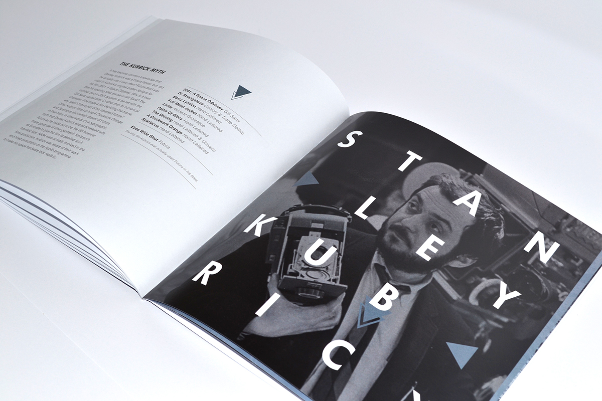
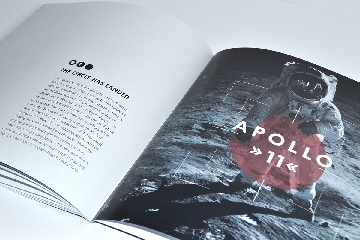
The publication then follows Hitler's rise to power and his fragmented evolutinary vision to eradicate the new typographic movement through the implementation of Blackletter and creation of his own Aryan race, much like Futura fanatic Stanley Kubrick and his film 2001: A Space Odyssey. Ironically, Kubrick never made use of Futura, although he was aware of NASA's work and hired consultants on the Apollo program to make his space hardware realistic. The Apollo 11 mission itself made extensive use of the typeface. It was used on the plaque presented on the moon to commemorate a new future which rejected the old and celebrated the new.
The final book and complimentary poster encompass a square format to highlight the geometric nature of the narrative. Using gritty tones of blue to supplement the space theme alongside hand marbled patterns contrasts against vibrant reds associated with the Nazi vision.